2010. július 17., szombat

On the Matter of Style: Some Examples

Eredeti: wizwow, Lightning Essentials

Style and Vision: Some Examples of Photographers who have it
We were talking about style and vision in the last few posts. I thought I would take this point to show some photographers who I believe show a lot of vision and style. This is as nearly a random sampling of the photographers I love as possible. There are a lot of shooters in my ‘vision’ tab… these are only a few.

We see a lot of talk about ‘vision’ and ‘style’ and they are difficult to put into a specific, detailed set of parameters.

Style – noun (OnLine Dictionary)

1. The way in which something is said, done, expressed, or performed: a style of speech and writing.

2. The combination of distinctive features of literary or artistic expression, execution, or performance characterizing a particular person, group, school, or era.

3. Sort; type: a style of furniture – a type of photography.

4. A quality of imagination and individuality expressed in one’s actions and tastes: does things with style.

5.a. A comfortable and elegant mode of existence: living in style.
5.b. A mode of living: the style of the very rich. (Photographers… heh)

6.a. The fashion of the moment, especially of dress; vogue.
6.b. A particular fashion: the style of the 1920s. See Synonyms at fashion.

We have talked about style before on Lighting Essentials:
“Style: It’s Not What You Shoot. It’s How You Shoot It.”
“Salina Maitreya: 4 To Do’s for Photographers (Interview in Three Parts)”
“What Makes a Photograph ‘Great?’”
““Breaking Out” as a Professional Photographer: Daron Shade”
So take a look at those articles when you get a chance.

Pretty good definition list, but what do we make of them. (5b is a given for photographers, so we won’t get into that one. My Bentley driver may have a few words later, but only after he fuels up the jet for the weekend MM shoot.)

Let’s see what we can attach to some of the photographers I have listed here. Spend some time at each photographer’s site. Note how the definitions above start to make sense as we view the images.

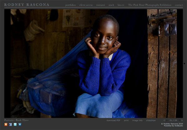
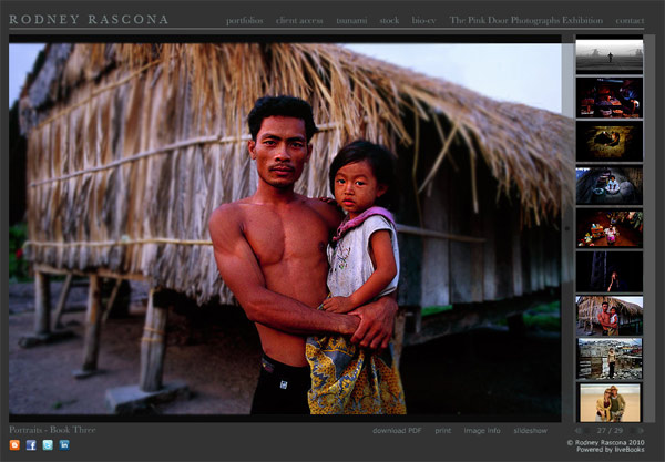
Rodney Rascona is a fellow Phoenician. His work has always been top of mind for me in this area. A talented photographer who has maintained a strong presence in the national advertising scene and still lives here in the desert. Rodney’s work ranges from portrait to automobile to travel… and he has a style that is so prevalent in his work.

Photograph by Rodney Rascona, Phoenix. www.rascona.com

Photograph by Rodney Rascona, Phoenix. www.rascona.com


Photograph by Rodney Rascona, Phoenix. www.rascona.com

Photograph by Rodney Rascona, Phoenix. www.rascona.com

Spend some time with Rodney’s work and note how he creates his style. Composition and light as well as presentation are consistent. A drama that is created by formal design and light with contrast to define. Colors are vibrant.

Across the genres of portraits, automobiles and even the photojournalist like shots of the tsunami, there is a consistency of vision.

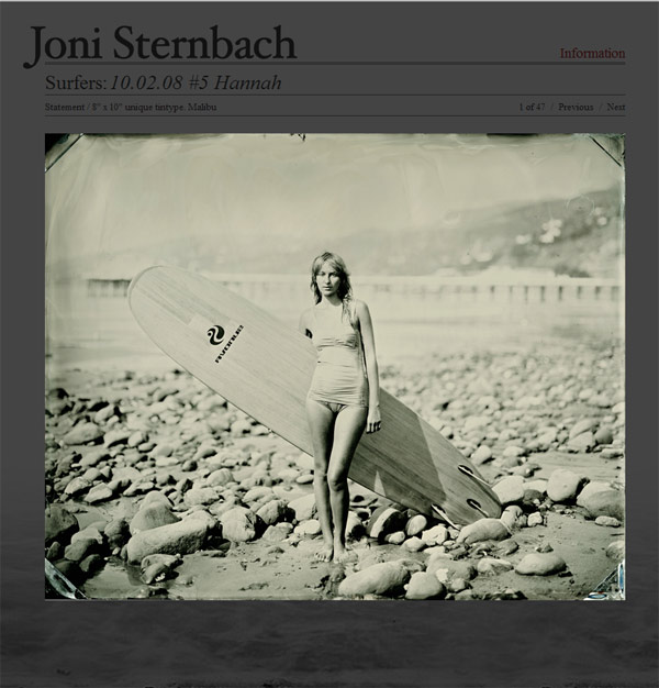
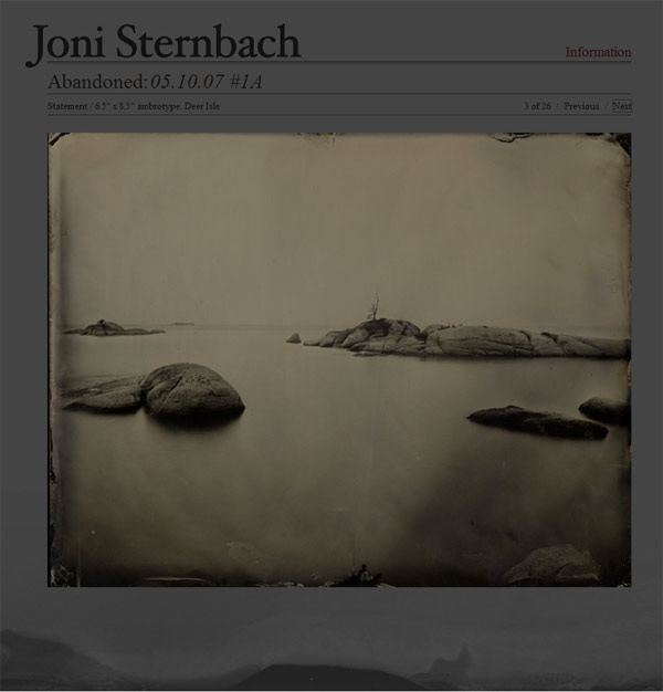
Joni Sternbach is a huge favorite of mine. Her work ranges from portraits to landscapes.

Joni Sternbach, Photographer : www.jonisternbach.com

Joni Sternbach, Photographer : www.jonisternbach.com


Joni Sternbach, Photographer : www.jonisternbach.com

Joni Sternbach, Photographer : www.jonisternbach.com

Sternbach chooses an older process for her prints, and uses large cameras for perspective control and limited Depth of Field. But it is beyond the choice of camera and process that makes her images take on a specific vision and style. Study how she approaches the “Surfland” images and compare that to the imagery in the “Salt Effect” series. Portraits of surfers and landscape work tied together by a vision and execution that show a single photographer’s style.

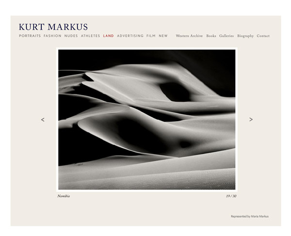
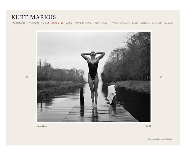
Kurt Markus shoots fashion, sports figures and landscapes… how’s that for variety. And yet the distinctive vision that Markus displays is across all genres.

Kurt Markus, Photographer: www.kurtmarkus.com/

Kurt Markus, Photographer: www.kurtmarkus.com/


Kurt Markus, Photographer: www.kurtmarkus.com/

Kurt Markus, Photographer: www.kurtmarkus.com/

A great example of it being not ‘what you shoot’ but ‘HOW you shoot what you shoot’, Markus’ clean style and intimate, natural approach to his images keep his vision consistent. Classical, almost historically iconic approaches to his subjects combine with a fresh, natural feeling seems to run through his work. Modern classicism? Maybe. See what you can find as you go through the images slowly and with deliberation.

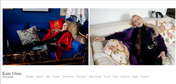
I love Kate Orne’s work. It is approachable, natural, elegant and totally free of conceit. It is an approach that lets the subjects be the subjects. No banks of lights and Photoshop magic, just honestly beautiful images.

Kate Orne, Photographer: http://kateorne.com/portraits/

Kate Orne, Photographer: www.kateorne.com


Kate Orne, Photographer: www.kateorne.com

Kate Orne, Photographer: www.kateorne.com

Notice also how Orne’s style crosses over to her travel work and studio work. It is a vision that is hers, and the style is in the work itself. Beautifully photographed and simply presented imagery.

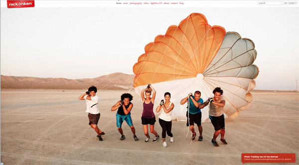
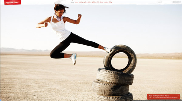
Nick Onken is a guy I go to often to just smile and take in great imagery. He keeps his work fresh and identifiable by keeping the style consistent. And that consistency has led to major campaigns and recognition from all over. His book “PhotoTrekking” was reviewed here on LE and is a fantastic addition to any photographer’s library.

Nick Onken, Photographer: www.nickonken.com

Nick Onken, Photographer: www.nickonken.com


Nick Onken, Photographer: www.nickonken.com

Nick Onken, Photographer: www.nickonken.com

Nick’s color palette, natural light approach, fun and witty composition and strong emphasis on Point of View gives some consitency. His attention to detail, in every instance, brings an excitement to the images and draws the viewer in. You will have a lot of fun looking through Nick’s work.

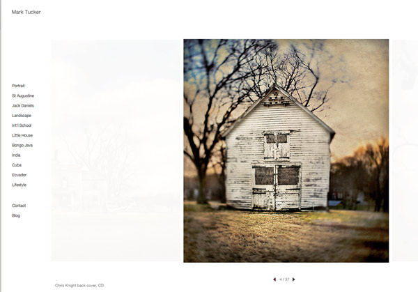
Damn, I am a big Mark Tucker fan. Such compelling work and with such conviction of style. Whatever Mark shoots, it is presented in what seems like the most perfect way. There is a pronounced absence of ‘over-the-top’ processing or faddish types of lighting. The work is consistent in color, composition and vision.

Mark Tucker, Photographer: www.marktucker.com

Mark Tucker, Photographer: www.marktucker.com


Mark Tucker, Photographer: www.marktucker.com

Mark Tucker, Photographer: www.marktucker.com

Mark’s work can be quirky and fun as well as serious. His use of old lenses, tilt-shift lenses and textures also makes the work accessible and seem like a blend of art and commercial… with an emphasis on personal style. As you go through his images, think of the choices he is making as he is designing the shots. What you see in Mark, and all the artists here, is a deliberate attention to detail. If it is in the shot, it was meant to be. The light is chosen to set the subjects off in a specific way… and that approach is taken across genres in his work.

Last up is Bill Phelps, a fantastic shooter that I recently discovered. I am so in tune with this work. Personal, engaged and without the vestiges of over-commercialism, the work Phelps delivers is most definitely his. Not a lot of compromise shown in the vision… it is tightly held and demonstrated in every shot he shows.

Bill Phelps, Photographer: www.billphelps.com

Bill Phelps, Photographer: www.billphelps.com


Bill Phelps, Photographer: www.billphelps.com

Bill Phelps, Photographer: www.billphelps.com

I am captivated by his post-modern style and the way he uses the frame to isolate sections of the world, and presenting them as slices of reality. A reality that is charged through the use of black and white. The work has a film look to it, although I have no idea if it is film or digital… nor do I care. The careful use of light that is infused within all of his work is intriguing and elegant.

As you look through the images of these photographers ask yourself these 5 questions:

1. What is the thing that ties the work together for you?
2. If the work was presented within different post-processing would it still stand?
3. What is the compositional approach that the photographers use to bring their work cohesiveness?
4. How is light used to enhance or alter the reality in the work?
5. Quick, describe the photographer’s work, style if you will, in less than 8 words.

Of course not every single image will contain every element of a photographer’s style, but taken as a whole – a “body of work” – the images belong to each other. And to the photographer that created them.

A challenge:
Can you find the elements that tie your photographs together and show how they work to present a body of work? Are they cohesive enough to show you as a photographer with vision or just a photographer? And, hey, it is great to be a good photographer. Let’s step it up a bit and be a good photographer with style and vision.

It’s damned hard work. It is a gray area, a nebulous enigma entwined in the emotional ties we have with our work. It is the ability to grasp and let go at the same time. It may mean a slight tweek to what we are doing. It may mean a total disc wipe and on to a new chapter.

But whatever it is, it will be important for us in the long run to have developed a style. Doesn’t mean we are locked in to only one, but one is good to get started.

Thanks for tagging along and I hope I have your juices going on what style may be, how to look for it in the work of others, and your own. It is a journey that can have lots of pulling of hair and gnashing of teeth. Sometimes you feel isolated and fearful and sometimes joyous and victorious. All part of the next climb in the journey.
2010. július 16., péntek

How To Take Better Photos: Leave Your Camera Behind

Eredeti: Peter West Carey, Digital Photography School, How To Take Better Photos: Leave Your Camera Behind: "

To keep in the mood of this post, I’m not going to include a picture, as is DPS’s custom. This post is about just that, not taking and posting photos. I do it a lot, more than most probably realize (no thanks in part to the fact that I have a Photo Of The Day feature on my blog) and it’s something that I think makes me a better photographer. Not better as in, “I’m better than you”, but better as in it’s a method I use to help myself improve.


In general I’m speaking about travel photos here, but it can apply to any photography. When I’m out at some location far from home and everything is ohhh ahhh new sparkly shiny grand, I have impulses like a lot of you, to start snapping photos of everything. “Wow! Look at that family on a moped!” “Now that’s a cool archway!” “Oh, my daughter would love a picture of those cats!” Overwhelming at times, isn’t it?


Over the years I’ve learned, and am still learning, the art of doing nothing. In this case, not photographing, but still observing. On my last trip to Nepal in April I spent two days walking around Kathmandu, alone, without a camera. Let me tell you, there was some cool stuff I saw. Neat cool stuff. Totally. Lots of it. So bizarre for someone from the USA. But that’s about all you’ll hear about it, because I wasn’t shooting. I purposely left my camera at my friend’s place so I could just observe and take it all in and get a better feel for my surroundings.


I do look differently at the world through the lens. I’m trying to grab something; time, space, newness. What I’m not doing is really experiencing my surroundings. When I put a camera to my eye, even though I typically shoot with both eyes open, I get tunnel vision, bad. Maybe you do too. Hyper focus (har har har). But it’s true. The rest of the world falls away and although I keep enough wits about me to be cautious of danger, I’m not listening or smelling or feeling as much of the world around me. I’m just curious about what I see through the lens.


So when I leave the camera behind, I’m able to get a better feel for a place. You notice I use the word feel a bit in this post. It’s because that is one aspect of travel that I love, just feeling the difference in a new place until it becomes commonplace, if I stay long enough for that to happen. Once I get a better grasp of how a location feels, I have found I then take better pictures. Maybe seeing the same merchant on different days gives me a better idea of who he is. Let’s say on the first day he looks dour, but on the next three days he’s happy and chipper, even striking up a conversation. While a photo on the first day would in fact be accurate of how he was that day, it’s not really how he is most of the time. It’s the same with a location. Horrible traffic one day could be easy sailing on other days.


There is no right or wrong way to take travel photos (except for completely over exposing everything into whiteness, I suppose). I’ve found what works for me is taking a break from the myopic view behind the camera when I can’t see past the viewfinder. Sure it’s not always possible, especially if you’re on a tour and only going to pass by the Eiffel Tower for a two hour break. By all means, snap away. But try setting the camera down some time and taking a walk through your new environment without it as a distraction. Get a feel for your new location.


Then go back, grab the camera, and translate that feel into beautiful photographs.

"

Image Sequences in Photoshop

Eredeti: Sean Duggan, Layers Magazine, Image Sequences in Photoshop: "

Arranging multiple shots of a motion sequenced together can sometimes produce very interesting results. In this article, we’ll explore how you can use the auto-align layers and auto-blend layers in Photoshop for assembling a sequence of different photos into a single multi-image composite.


1 THE ADVENT OF MOTION SEQUENCES

Although motion sequence images are very familiar to us today, the first high-speed motion studies by Eadweard Muybridge in 1878 represented a stunning technical achievement that revolutionized photography and revealed aspects of movement that had never before been seen. Using multiple cameras loaded with wet glass plates arranged along a racetrack, his motion studies of a running horse finally settled the long-debated question of whether all four of a galloping horse’s hooves left the ground at the same time (they do).


Photo by Eadweard Muybridge


2 IN THE FOOTSTEPS OF MUYBRIDGE

With modern cameras, high-speed motion is easily captured without having to go to all the trouble and expense that Muybridge did to record his images. The use of Photoshop layers and layer masks provides ways of blending these images together that extend the photographs beyond a simple, side-by-side sequence. In Adobe Photoshop CS4, additional features such as auto-align layers and auto-blend layers further expand the possibilities for creative blending of sequenced photos.


3 TECHNIQUE OVERVIEW

The technique we’ll explore works well with certain types of images for combining different poses of a moving figure into one shot. Results will vary depending on the images you use; some may require more mask editing than this example. A tripod isn’t necessary but a consistent distance between camera, subject, and background is essential so that the depth of field matches. When photographing the girl, I panned the camera to follow her as she ran. The length of the pan was fairly short, which is important so that the background isn’t distorted once the images are assembled.


combining the source images


4 LOAD FILES AS PHOTOSHOP LAYERS

The first step is to bring all of the source photos together as layers in one file. You can launch this process from either Adobe Lightroom or Adobe Bridge. In Bridge, Shift-click all of the image thumbnails and choose Tools>Photoshop>Load Files into Photoshop Layers. In Lightroom, the corresponding command is Photo>Edit In>Open as Layers in Photoshop. When this process is complete, you’ll have a single file open in Photoshop with each of the source images as separate layers.


5 CHOOSE AND LOCK REFERENCE LAYER

The next step is to have Photoshop align the layers for us so that all of the background details match up. Before beginning the alignment process, choose one of the layers—we selected the Girl-2 layer—as the alignment reference around which the other layers are adjusted and then lock it by clicking on the Lock All icon (circled) at the top of the Layers panel. Now click on the top layer and Shift-click the bottom layer to select all layers.


6 AUTO-ALIGN LAYERS

Next, choose Edit>Auto-Align Layers. In the Auto-Align Layers dialog, click on the Auto radial button to set the Projection method to Auto, leave the Lens Correction options unchecked, and click OK to align the selected layers.


7 ALIGNMENT INSPECTION

Once the auto-alignment is done, click on the Eye icon in front of each layer except the bottom one (Girl-4) to turn off the visibility of all layers but that one. Now turn each layer on again (click the Eye icon), one at a time, and inspect the accuracy of the auto-alignment. For this particular image, the cobblestones and the background line up remarkably well across all four images.


8 AUTO-BLEND LAYERS

All of the layers should still be selected. If they’re not, click on the top one and then Shift-click the bottom one to select all. Choose Edit>Auto-Blend Layers. In the Auto-Blend Layers dialog, set Panorama as the Blend Method and enable the checkbox for Seamless Tones and Colors. Click OK to begin the blending process.


9 AUTO-BLEND LAYERS RESULT

When the auto-blend layers process is done, you’ll see that it has created precise layer masks for all of the layers. It has also has altered the brightness of the layers so that the tonality in the background now matches perfectly. Three of the girls are visible, but the second one from the left (Girl-3) is completely hidden by the layer mask that was created for that layer. In the next steps, we’ll edit the layer masks to reveal the missing girl.


editing the layer masks


10 USING GUIDES TO MARK LOCATION

Click the Eye icons beside the top two layers in the Layers panel to turn off their visibility. Shift-click on the layer mask thumbnail for the Girl-3 layer to temporarily disable it. Choose View>Rulers. Click on the vertical ruler and drag guides into the image to mark the Girl-3’s location so you can see where to edit the layer mask in the next step. Now you’ve marked the location in the composite where the figure from the Girl-3 layer should be.


11 EDITING THE GIRL-3 LAYER MASK

Shift-click on the Girl-3 layer mask thumbnail again to turn it back on. Choose the Brush tool (B) and open the Brush Preset Picker in the Options Bar. Select a 200-px brush, and drag the Hardness slider to 100%—a hard-edged brush will blend best with the existing hard-edged layer masks—and then set the brush Opacity to 100%. Now set your Foreground color to white and paint on the layer mask for Girl-3 in the area between your guides where the girl should be. You don’t need precise brush strokes and it’s okay to reveal extra background around her.


12 TURN ON GIRL-2 LAYER

Now turn on the Girl-2 layer in the Layers panel. This will probably cover up most of the Girl-3 layer that you just revealed, which means that you must now edit the layer mask on the Girl-2 layer. Click on the Lock All icon at the top of the Layers panel to unlock this layer and then click on the layer mask thumbnail to make it active.


13 EDITING GIRL-2 LAYER MASK

Press the X key to exchange the Foreground/Background colors so the Foreground swatch at the bottom of the Toolbox is now black. We’ll use black—because black conceals and white reveals—to paint on the layer mask for Girl-2 to hide those areas that are obscuring the girl’s figure on the underlying layer (Girl-3). If you inadvertently reveal transparent areas, we’ll fix it in the next step by re-editing the layer mask for the underlying layer.


14 FINAL MASK EDITS

To fix any remaining transparency holes, click on the layer mask thumbnail for the Girl-3 layer to make it active. Press the X key to exchange the colors to make your Foreground color white. Paint with white to cover up the transparency holes by revealing that layer. Turn on the top layer (Girl-1) and zoom to 100% (View>Actual Pixels) and carefully inspect each of the girls to ensure that there are no rough edges that need to be fixed. If you do find rough edges, determine which lay

er mask needs to be edited, and then make the appropriate edits.


15 FINAL CROPPING

As a final step, use the Crop tool (C) to remove the transparent edges and create a more centered composition of the “four” girls. With these particular images, using auto-align layers and auto-blend layers produced an excellent result. It’s important to understand, however, that when using images of different scenes, your mileage may vary and you may run into problems that require additional editing or using different images. We’ll go over a few of these potential glitches in the rest of this article.


potential problems


16 BEWARE OF STACK IMAGES MODE

Before we get into potential image problems, I’d like to point out that when you’re making this type of blend, you should not use the Stack Images option in the Auto-Blend Layers dialog. It will create a strange blending between the layers that, while possibly interesting, can’t be edited, because the color and tonality of the actual layers is changed in the blending process.


17 FOCUS AND DEPTH OF FIELD ISSUES

In the running girl photos we used in this tutorial, the distance from camera to subject and camera to background was the same for all four shots, which meant that the depth of field in all the shots was consistent. In this example, however, the focus and depth of field change as the girl moves away from the camera, which results in obvious problems where the focus doesn’t match. A subject that moves away from or toward the camera, as opposed to moving parallel to the camera, will create more potential problems.


18 BUSY OR MOVING BACKGROUNDS

You may also run into alignment problems on images with particularly busy or complex backgrounds. And moving elements in the background create their own set of issues that present tricky problems for the auto-alignment and auto-blending features. In this example, the masks created by the auto-blend layers don’t do a good job with the differences in the ocean behind the girl. For this, we created a manual mask that used the water from only one of the images, thus creating a background with no mismatched waves.


"

It’s Guest Blog Wednesday featuring Aaron Johnson!

Eredeti: Scott Kelby Blog, It’s Guest Blog Wednesday featuring Aaron Johnson!: "

1_self-portrait-stripsm


Thank you, Scott for letting me interrupt your guest blog series with some unnecessary foolishness.

Photographers are a weird bunch, which is why a daily comic strip centered around the business writes itself (or so I wish). For this guest blog I’ve decided to highlight 10 themes (some controversial) that have made for good comic fodder over the years.


1. Man vs. Machine

One of the six elements of comic strip humor is writing something that is “recognizable”. It’s no wonder then that this strip has become an all-time favorite to many…


2_WTD95sm


OK, who HASN’T heard that before? By the way, I’m still look looking for an upright bass that will make me sound like Brian Bromberg.


3_WTD433sm


2. Pro or Pro bono

4_WTD43sm


That strip has been turned into a verb. My dad emailed me to let me know he was “WTD43′d” one time. Writing for one of the most unregulated industries provides a fair amount of material. Who’s a professional, who’s not and who cares?

The following strip is inspired by the second most asked question of photographers. (the first most asked question being: “Can I have a copy of that?”)


5_WTD128sm


3. Photoshop vs. Photosh*t

Photoshop – It’s just a tool. Really? Just?! This may be the understatement of the century when considering Photoshop’s impact on photography in the last twenty years. It may also be one of the most abused “tools” in recent history.

6_WTD466sm


Endless debates exist as to how it should be used and how much it should be used. When something looks TOO GOOD, it MUST have been Photoshopped.


7_WTD198sm


Unfortunately, powerful post production tools have created a lazy “fix it in post” attitude among many professionals. Personally, being on the back end of many shoots (both live and still) it’s a frustrating job security.


4. Size matters

8_WTD422sm


It’s not the ax, it’s how much attention it can get you. And yes, I’ve pulled the big gear card before and it can get you free admission and better seats. I have no shame.


9_WTD832sm


5. Gearheads

10_WTD174sm


Photography is a very interesting hobby where half the population is obsessed with the technical aspects and the other half doesn’t know what an f-stop is. That’s probably what makes photography great. It’s so inclusive. People can find joy in complete different aspects of the medium. Some find joy in peeping, some find joy in seeking.


11_WTD630sm


6. R-E-S-P-E-C-T

12_WTD274sm


WTD is like the Rodney Dangerfield of photographers. It makes for better humor. A comic strip about Scott Kelby just won’t be as funny.


13_WTD342sm


7. HDR

I looked through the 1000 plus WTD strips and just realized I didn’t have an HDR related strip. So here’s one I created exclusively for the Scott Kelby blog…

14_WTD-HDR-comicsm


8. Film

The following strip is based on a very real experience I had…

15_WTD223sm


You have to kind of feel for all the abandoned film cameras out there. Of course they’ll have plenty of company with all the outdated digitals.


16_WTD337sm


9. Low-ball-ers

17_WTD381sm


It’s really fun and cathartic writing for a character who has the absolutely worst clients in the world. The sad part is how many of these strips hit really close to home for so many.


18_WTD185sm


10. Edumacation

19_WTD518sm


Photography/education is always an interesting topic-combo to tackle. I’d like to know the ratio of DIY’s versus formally educated photographers. If the DIY’s aren’t in the lead, they certainly will be after enrolling in the duck’s class…


20_WTD490sm


Thanks again Scott, for letting me lampoon your awesome blog. And thank you, to everyone who has supported WTD over the last four years. May we never forget to stop and laugh at ourselves every now and again :)


For more What The Duck, check out WhatTheDuck.net, follow @WTDComics on Twitter, or check out the Facebook page.

"